

In my opinion, when a photograph is described as “graphic”, it refers to the abstraction of the image’s elements (that you can often relate to posters). This is usually done with strong contrasts, sharp edges and few elements. Parisian posters like this one from the early 20th century are historical examples from the advertising industry.
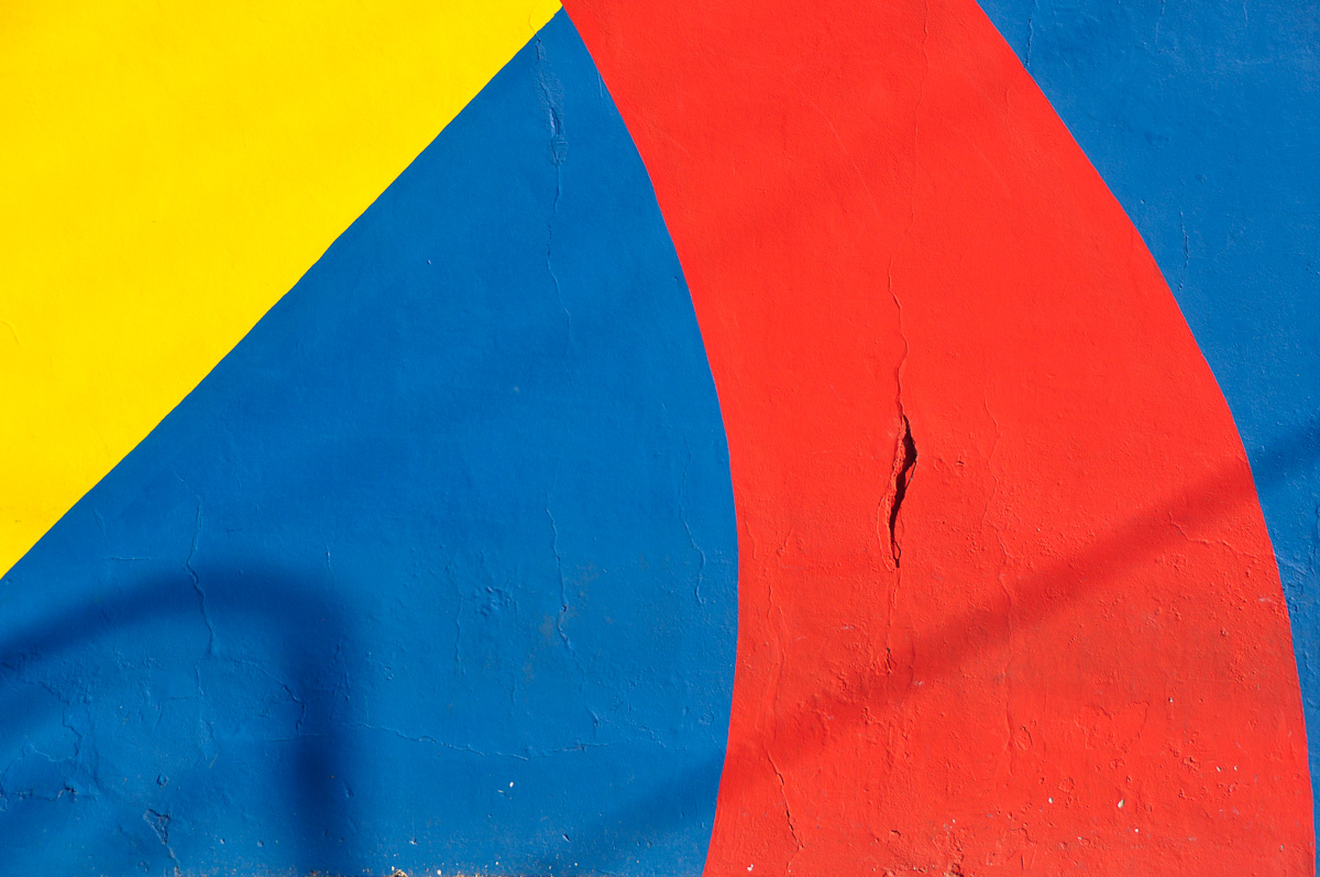
This picutre, taken at the “Caminito” in Buenos Aires on a late summer afternoon, is an example of an extremely graphical photograph. The surface is perfectly flat and the elements are strongly contrasted by the colors. Obviously it’s not hard to create a posterlike photograph from a painted wall. Nevertheless, with pictures like this, baring “no content”, human elements, stories to tell etc., it’s all about the asthetics and fine-tuning in the composition. Composition is the way you place the elements that form your image into the frame. Mostly subconsciously, we are attracted by things that follow the rules of harmonious proportions. Note that you don’t need flat surfaces to do graphic picutres, it just gets more challenging. Black and White together with strong light at noon give some easy first results.
Personally I am not such a huge fan of this style, yet the strength through simplicity of this picture, together with it’s striking colors just made me think about the subject.
Technical remark: You will probably see the colors on this one differently than me. That’s because most monitors are not well callibrated, giving the reason why some pics look so different once they are printed, but that’s a whole different topic.