To read and to understand

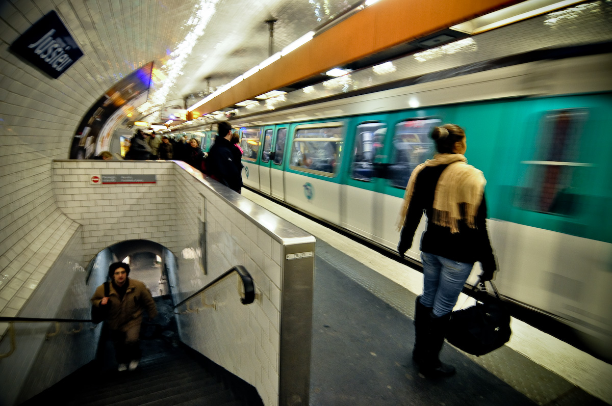
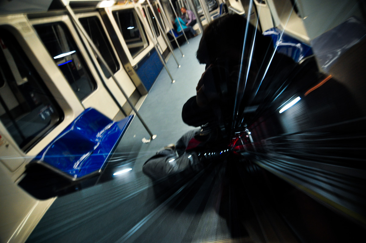
When a photograph lies infront of you, you uncounsly read it. You eye is unable to see more than just a tiny spot with full sharpness. So when you see a picture (unless it’s tiny) your eye scans it for certain patterns. Usually those are: foreground before background, light before dark and left before right.

When you check out the picture above, it starts as a seamlessly looking scene inside some sort of train. Then you continue towards the right (and dark) part and it starts getting confusing. Questions arise and confusion starts: How was it possible to take this picture? Are those two pictures in one? What’s the black silhouette on the right half? Where is the photographer? Continue reading “To read and to understand”

The Human Ingredient

Images with a good composition, often have lines leading towards the corners, tangents gently touching the sides, objects placed by the golden ration and so on… Yet geometrically well composed pictures often lack a certain “something”. This little something that gives a scene it’s uniqueness so that you truly captured a moment in time that could not have been taken a second later or a second before.

Wherein lies that certain something? Well it’s mostly the so called “élément humain” (french) or the humant element/ingredient. Humans are hard to control and that’s why photographers often tend to avoid them. There is barely anything more interesting and at the same time more complicated that human beings in front of a lens, but that’s a whole different subject.

For comparison: this is overall geometrically the same shot but with no interesting elements in it. The original is there for comparison: